Visualize Pull Requests as Diagrams
Aykut Sarac
• March 17, 2026
Lately I've noticed a weird pattern in pull requests.
A PR shows up with hundreds of lines changed. Some files look hand-written. Some clearly came from AI. The commit message is something like "refactor data model" or "improve API response".
You start scrolling the diff.
At some point you realize you're not really reading code anymore. You're trying to reconstruct what actually happened in the system.
Did a new component appear? Did the API flow change? Did we introduce a new dependency between modules?
The diff technically shows the changes, but understanding the story of the change takes work.
Text diffs are great for showing modified lines. They're not great at explaining systems.
The vibe-coded PR problem
A lot of teams are now doing what people jokingly call "vibe coding."
You prompt an AI, tweak things, regenerate, run tests, repeat. Eventually you open a PR.
It works. Tests pass. But the structure of the change isn't always obvious.
A PR might touch ten files and introduce a new flow across them. The diff shows the edits, but reviewers still need to mentally reconstruct what the new architecture looks like.
Your brain becomes the diagram engine.
That's slow.

Let the LLM explain the PR as a diagram
What reviewers actually want to know is: what new components appeared, what relationships changed, did the data flow change? Those are structural questions, not textual ones.
Many pull requests change the shape of a system. A new module enters the dependency graph, a new step appears in a request flow, an API route connects to new logic.
But Git diffs fragment these changes across dozens of lines.
Instead of mentally stitching it all back together, you can ask an LLM to do it.
- Give the LLM the PR diff
- Ask it to explain the change visually
- Render the result as a diagram
Rather than producing paragraphs of explanation, the model generates a diagram structure. That structure is then rendered with ToDiagram.
The interesting part is that the diagram isn't predefined. The model decides what kind of diagram best explains the change — architecture diagrams, module graphs, data models, flow diagrams, or sequence-like flows.
The goal isn't to mirror the code. It's to explain the behavioral change.
Example: a real PR from the Vite repository
To see how this works in practice, I tried it on a real pull request from the Vite repository: #21624.
The PR modifies how HMR handles circular boundaries and update propagation.
Instead of starting by reading the diff, I asked the agent to explain the PR visually using the ToDiagram skill.
The model read the diff and generated a diagram describing things like:
- How module updates propagate
- How circular boundaries are detected
- When reload vs re-execute happens
Here's what it produced:
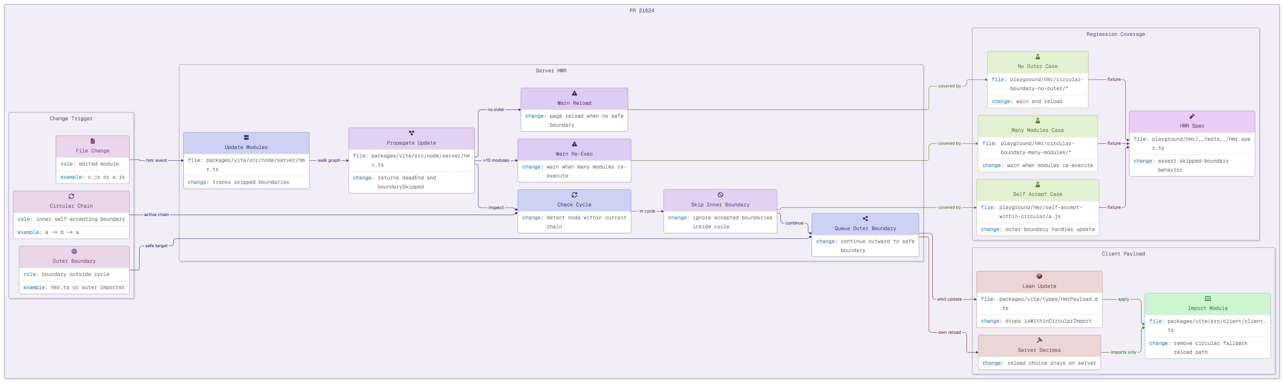
The diagram acts like a structural summary of the pull request.
You can quickly see the update flow and decision points before digging into the actual code.
Once you understand the shape of the change, reading the diff becomes much easier.
PR review becomes:
"Look at the diagram, understand the system, verify the code."
instead of:
"Scroll through everything and hope the structure becomes clear."
Getting started
If you want to try this workflow in your own repository, you can add the ToDiagram skill with:
npx skills add todiagram/skills
After installing the skill, you can ask your coding agent something like:
Read this PR diff and generate a diagram explaining the change using the ToDiagram skill.
The agent analyzes the diff, generates a diagram structure, and ToDiagram renders it.