Customize Theme
Personalize your diagram appearance with custom colors for nodes, edges, and text elements
ToDiagram allows you to fully customize the visual appearance of your diagrams by creating custom color themes. You can change colors for nodes, edges, text elements, and more to match your brand or personal preferences.
Overview
The custom theme feature provides granular control over:
- Node colors: Background, borders, dividers, hover states, search highlights
- Edge colors: Connection lines, labels, hover states
- Text colors: Keys, values, data types (numbers, booleans, null), collapse buttons
Your custom theme is saved locally and persists across sessions.
Accessing Theme Customization
Open the Theme Editor
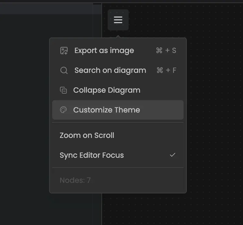
Click the paint palette icon in the diagram toolbar to open the Custom Theme modal.
Choose a Category
The theme editor has three tabs:
- Node: Customize node backgrounds, borders, and states
- Edge: Customize connection lines and labels
- Text: Customize text colors for different data types
Customize Colors
Select any color property and use the color picker to choose your desired color. Each property shows a descriptive label explaining what it controls.
Theme Properties
NODE Properties
| Property | Label | Description |
|---|---|---|
NODE | Node Background | Default background color for nodes. |
HEADER | Header Background | Background color for the header row within nodes. |
EDGE Properties
| Property | Label | Description |
|---|---|---|
EDGE | Edge | Default color for connection lines. |
LABEL | Edge Label | Text color for edge labels. |
TEXT Properties
| Property | Label | Description |
|---|---|---|
TEXT | Text (Default) | Default text color. |
ROW_KEY | Row Key | Text color for object keys or property names. |
NUMBER | Number | Text color for numeric values. |
BOOLEAN_TRUE | True | Text color for boolean true values. |
BOOLEAN_FALSE | False | Text color for boolean false values. |
NULL | Null Value | Text color for null values. |
PARENT_ROW_TEXT | Header Text | Text color for parent or header rows. |
Theme Actions
Enable/Disable Theme
Toggle the "Enable Custom Theme" checkbox to turn your custom theme on or off without losing your customizations.
Color Grouping
Enable "Color Grouping" to automatically assign different colors to related nodes based on their position in the data hierarchy. This helps visualize data structure more clearly.
Reset Theme
Click the reset icon to restore all colors to their default values.
Download Theme
Click the download icon to export your custom theme as a JSON file. This allows you to:
- Back up your theme configuration
- Share themes with team members
- Version control your themes
Example theme JSON:
{
  "NODE": {
    "NODE": "#ffffff"
  },
  "EDGE": {
    "EDGE": "#BCBEC0",
    "LABEL": "#909090"
  },
  "TEXT": {
    "TEXT": "#000000",
    "ROW_KEY": "#5199FF",
    "NUMBER": "#D2AA1B"
  }
}
Troubleshooting
Custom themes are stored locally per browser. If you switch browsers or devices, you'll need to upload your saved theme JSON file.